Josh Reddick: The Reason Lester Became an Athletic


Reddick GIF


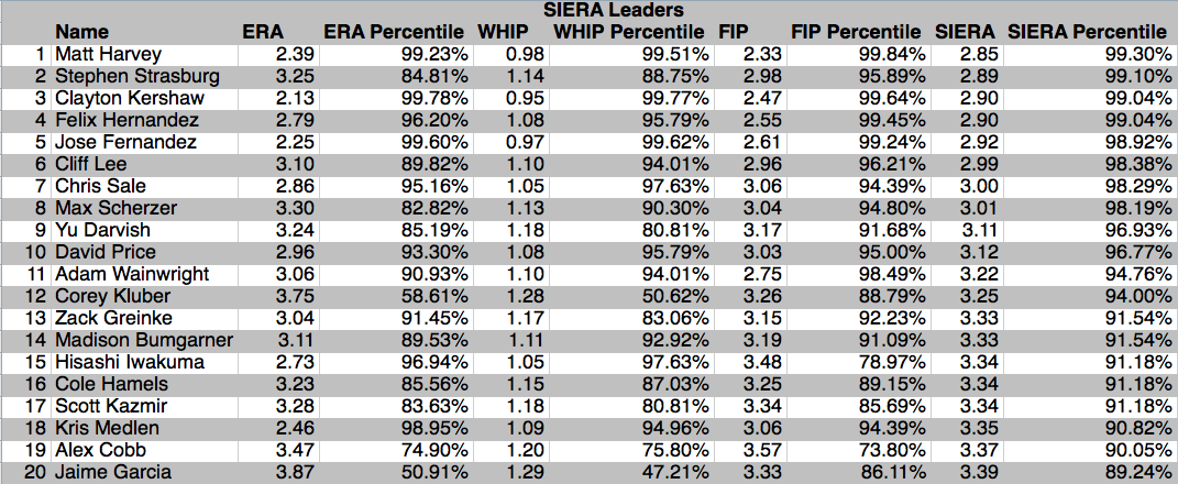
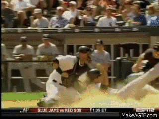
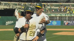
What if I told you that the most important player in making the Jon Lester trade happen was not part of the deal? Not Lester, not outfield slugger Yoenis Cespedes, and not crazy man/energizer bunny Jonny Gomes. What if I told you the most influential player is front and center in the GIF above, stroking two grown men’s beards?


That’s right, A’s outfielder (and former Red Sox player, coincidentally enough) Josh Reddick was that important to Oakland trading Cespedes, the team’s cleanup hitter and arguably best known player. Reddick broke onto the scene in 2012 with the A’s, hitting 32 homers in 156 games with the club. Reddick’s slash line of .242/.305/.463 was far from fantastic, but his impressive power, great defense, and dirt dog mentality on the diamond made him a very valuable player.


However, in 2013 and the first half of 2014 Reddick went from an important part of the A’s lineup to an afterthought. A number of nagging injuries cut into his power and playing time, resulting in a pedestrian .153 isolated power in 2013. Having Cespedes in the lineup helped mask the inconsistencies of Reddick, who in 2012 actually posted a higher ISO than his more celebrated teammate (.221 to .214, respectively).


Reddick rejoined the team on July 22nd this year after two extended stays on the disabled list, and the Athletics saw a completely different player in the nine games before the trading deadline. The unheralded outfielder had more doubles from July 22-30 (4) than he did in 51 games before his injury (3), as well as half as many home runs (2 post-injury and 4 pre-injury). This production certainly cannot be overlooked in the A’s front office’s decision to part with Yoenis Cespedes. Reddick profiles as a similar type player to Cespedes from the other side of the batters box: a low average, high power guy who plays solid defense. Add in Jonny Gomes to spell Reddick against the occasional tough lefty, and Oakland has poised itself to receive similar production from the outfield for the final two months of the season as well as in 2015. The A’s are all-in in their attempt to bring home the 2014 World Series while the Red Sox were steadfast at the deadline in their quest to acquire proven Major League talent; the Sox would only deal Lester for a player like Cespedes in return, and the Athletics would only be willing to deal an important part of their current lineup if they felt they had someone ready to pick up the slack. Without Reddick, Cespedes for Lester and Gomes would not have even been considered by the A’s.


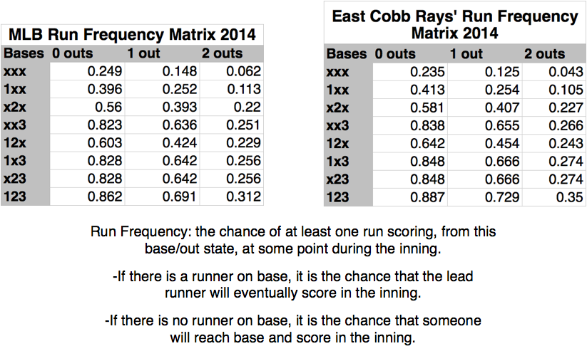
Of course, the question we must ask ourselves in any such case is if the player’s production will be sustainable. For Reddick, the answer is no. Reddick’s ISO and batting average on balls in play (BABIP) in the second half are much higher than his career averages. These are two of the most volatile metrics in baseball, and large differences from career norms can often be attributed to luck and/or small sample sizes, both of which are factors here. In addition, according to Baseball Heat Maps Reddick’s average fly ball length has been only one foot greater post-injury than pre-injury, implying he has had some luck with fly balls turning into doubles or home runs.


That being said, Reddick’s recent production should not be completely discounted. His line drive and strikeout rates are a good sign at nearly 5% and 15% better than his career averages, respectively, suggesting that the slugger is seeing the ball and squaring it up better since his return from the DL. This is not to mention the value of having Reddick back in the field for the second half, where he has always excelled.


Over the past year and a half, Josh Reddick has not looked like the great player he was in 2012. However, with some nagging injuries behind him Reddick looks poised for a solid, if not spectacular, end of 2014. With the A’s in win now mode, trading Cespedes for an ace in Jon Lester with Reddick ready to make up for the lost production makes perfect sense, and is why he is the man who made this deal possible.


And now for your viewing entertainment, a collection of some of my favorite Josh Reddick GIFs. You’re welcome.


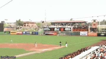
Showing off the cannon

Reddick Throw 2


“If you test me, you will fail” -Josh Reddick (probably)

Reddick Throw GIF


PIMP IT JOSH!

ax40p


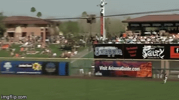
Nbd, just Reddick doing his best Spiderman impression

ax3h5


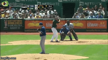
Oops, he did it again! IN THE SAME GAME, PEOPLE

ax3mq


Nothing like a couple of celebratory pies to the face

Reddick Double Pie GIF


“Sorry about that pie man, high fi–OH WAIT I GOT TWO PIES!”

Reddick Pie GIF

Ace of Clubs: How Many Teams Have True Aces


Defining a pitcher as an ace is as difficult as calling a quarterback elite in the NFL; everyone sort of knows what it means, but there is no universally accepted formula to determine who makes the cut.


Currently, determining an ace is essentially based on the eye test. An ace is supposed to be the leader of his team’s pitching staff, a guy who is capable of shutting down any opponent on any given day. It would be easy to simply categorize an ace as the number one pitcher on a team, but that is not necessarily true; some teams are talked about as having more than one ace (think 90’s Braves with Maddux, Glavine, and Hudson), while others might not have a true ace at all. With all of the pitching statistics available today, it seems logical that we could create a statistical basis for what makes a pitcher an ace, and how valuable that player truly is to his team.


Before we begin, let’s talk about the parameters for this study. The general consensus when declaring a pitcher an ace is a consistent track record of excellence—in other words, one great season does not an ace make. Therefore, we will be looking at starting pitcher statistics from 2012-2014.


For these starters, we will use a minimum of 200 innings to qualify. While the number of innings to technically qualify as a starter for this three-year period is 300, bumping the number down to 200 IP allows us to more accurately compare pitchers to league average. This gets confusing, but let me explain: each team in Major League Baseball has five starters, which means that at any given time there are 150 starting pitchers in the majors. Only 108 starting pitchers have thrown 300+ IP in the past three years, whereas 155 pitchers have thrown 200+ IP. Therefore, decreasing the innings requirement makes the data more representative of the whole population of starting pitchers. Weaker fourth and fifth starters are less likely to be given the opportunity to pitch because their production is more easily replaceable, so having a higher innings requirement would disclude some of them and artificially inflate pitching statistics.


Now that we have determined the sample of players, how do we decide which ones are aces and which are not? It is impossible to do so based solely on a statistical threshold because of the changing dynamics of the game. A pitcher with a 3.20 ERA during the steroid era would have been considered an ace, but today that would be barely above average.


One way would be to say that on average each team has one ace, so the 30 best pitchers in baseball are aces. I would argue that this number is too high; as mentioned above, many teams have solid number one starters, but not what is necessarily considered an ace. Another possibility is 20 aces; after all, there were 20 starting pitchers named to the All-Star Game this year. Still, I find this to be too high, as the All-Star selections are chosen based on half a season’s worth of production and can be mere aberrations. For aces to truly be special, they must be a very select and elite group.


So let’s say that at any given time there may be around 15 aces in baseball…that was supposed to be the easy part. Next, we need to determine who these best pitchers are. With the 2012-2014 starting pitching data, we can look at the average pitcher’s performance in four major categories: ERA, WHIP, FIP, and SIERA. Using the normal distribution model, we can determine each player’s predicted percentile compared to league average. Assuming there are roughly 15 aces, pitchers who grade out in the 90th percentile or higher would qualify, but to start we will take a close look at anyone consistently in the top 80%.

Screen shot 2014-07-28 at 2.21.31 PM

Screen shot 2014-07-28 at 2.21.56 PM

This is a lot of information to process, so let’s break it down by parts. ERA and WHIP (Earned Run Average and Walks + Hits per Innings Pitched, respectively) are standard pitching metrics that have been used for years to demonstrate a pitcher’s value. FIP and SIERA are more sophisticated sabermetrics which attempt to neutralize the variables inherent in ERA and WHIP and are weighted to an ERA scale. FIP, or Fielding Independent Pitching, measures the only play outcomes a pitcher can truly control—walks, strikeouts, and home runs—and puts them on an ERA scale to determine a pitcher’s true value. FIP has been proven to be a better indicator of future ERA for a pitcher than his past ERA, leading to its widespread use in baseball. SIERA, or Skill Interactive ERA, is similar to FIP but takes into account some variables from balls in play, making it even more accurate than FIP. For this reason, the tables above have been sorted by SIERA, as it is the best indicator of a pitcher’s true talent.


A lot of these names make sense. Strasburg, Kershaw, and Hernandez towards the top seems right, as do top ten names like Lee, Sale, Scherzer, and Price. Harvey and Fernandez are both young and out for the season, but when they have pitched they have been lights out. It is interesting to see some players who dropped in the rankings or appeared high on the list. Corey Kluber was a middle of the pack pitcher based on ERA and WHIP, but a borderline ace according to FIP and SIERA. Joe Blanton was terrible by most accounts, yet somehow checks in at 37, ahead of well-regarded starters such as Verlander and Lester (Lester did not even make the list, coming in at 43). Of course, these two starters were hurt by having an uncharacteristically poor year in this span (Lester in 2012 and Verlander in 2014), but it is still surprising to see them so low.


Besides Kluber, all the players in the top 15 rank in the upper percentiles in nearly every category, and could have strong cases made that they are aces of their respective pitching staffs. Some of the players in the 16-25 range could also have strong cases made for them, especially when adding in name recognition (Hamels, Cueto, etc). The problem is, some of these pitchers just might not have been around for long enough to really be considered aces. Guys like Harvey, Fernandez, and Medlen are injured and only have a short track record of excellence. Now let’s take a look at the same sample of starters and rank them based on WAR (Wins Above Replacement) to see how much they have contributed to their teams in the past three years.

Screen shot 2014-07-28 at 2.25.40 PM

This list certainly passes the eye test. All of the pitchers in the top 15 are studs, who based on public opinion would probably be considered aces. Guys like Verlander and Lester, who were hurt by down years in the averaged statistics like ERA and SIERA, are back atop the list due to their contributions the other two seasons. In addition, players like Harvey and Fernandez, who rank among the league leaders in WAR per inning, are not at the top of the list for WAR because they simply have not pitched enough. If both pitchers are able to successfully recover from injury and continue performing at a high level, they will move up this list in the future and become worthy of the term ace.


What I draw from this study is that WAR is the best indicator of who is an ace. While the four stats from the first table are important indicators of a pitcher’s ability, WAR is a better representation of a player’s overall contribution to his team and is not weighed down as much by one uncharacteristic season. Plus, WAR takes into account that pitchers who stay healthy and throw more innings are more valuable to their teams. WAR/IP is still useful to show a pitcher’s effectiveness when he does pitch, but WAR is more encompassing of his true importance.


Still, the statistics in the first table are essential to back up the WAR evidence. Having ERA and WHIP side by side with FIP and SIERA shows how the old and new metrics usually lead to similar takeaways, but sometimes discrepancies between them raise valid concerns about our perceptions of players. We can also use these stats to argue about “bubble aces,” if you will. For example, a pretty compelling case could be made for Madison Bumgarner as a blossoming ace based on his advanced pitching stats, while James Shields might be bumped off that pedestal after examining his.


To conclude, let’s set some basic statistical guidelines for determining an ace in the future. Pitchers who for the last three seasons have ranked in the 95th percentile or higher in WAR make the cut; pitchers from around 85%-94% are on the bubble, largely determined by statistics such as ERA, WHIP, FIP, and SIERA. And at the end of the day, some of our own bias goes into the decision as well. Being an ace is about current performance, but that does not stop us from remember Cole Hamels’ lights out showing in the 2008 postseason or Strasburg’s incredible final year in college. These prejudices will always impact our decisions—and perhaps to an extent they should—but having a statistical backbone allows us to compare players and better understand their abilities.

Quick Take: 5 Prospects to Watch


Scouting high school players in the Atlanta area has afforded me the opportunity to see some of baseball’s best young talent. Here is a look at five young players who stood out to me with their tools, and how their abilities were represented in TrackMan data.


Anthony Molina        RHP        Pembroke Pines, FL


At 6’5” 190 lbs, Molina has plenty of room left to grow into his frame and become even more menacing on the mound, which is a scary thought. When I watched Molina, he sat 88-90 MPH on his fastball with good action and a high spin rate at around 2200-2300 RPM (Major League average spin rate on a fastball is around 2200rpm; a higher spin rate makes pitches appear to have late action and rise on a batter). Molina touched as high as 92 MPH and 2400 RPM on his fastball, and I expect him to gain a significant amount of velocity as he matures. Molina also has a plus curveball with good break towards his off-hand due to his ¾ arm slot. He was able to spot his pitches well on both sides of the plate, keeping hitters off balance all game and demonstrating the ability to pitch, not just throw. This manifested in an excellent stat line on the day: 3 IP, 0 H, 1 BB, 6 K.


The sky is the limit for this kid; with two solid pitches, a deceptive motion, and great arm speed, he could be something special. Plus (get this), he is only 16. Although he is committed to Miami, I expect Molina to forego college and sign with whichever team drafts him in the first few rounds of the 2016 draft.


Jahmai Jones        OF        Roswell, GA


Of all the players on this list, Jones is probably the only legit five-tool prospect. Jones’ bat speed and hitting ability were on full display when I watched him, hitting the ball to all fields and consistently getting on base. Jones also showed impressive power, hitting three home runs in the two games I watched. Jones’ second blast was a very impressive 381 foot bomb to straightaway center, 99 MPH off the bat. Add in a strong arm and his athletic play in centerfield and on the bases, and Jones is an extremely well rounded prospect.


Beyond these tools, Jones impressed me with his grit on the diamond. With his team down 1-0 in the bottom of the sixth, Jones hit a go-ahead three-run home run to left field, and was noticeably fired up rounding the bases. Teams who invest high picks in prospects want to see passion and a desire to be great, and Jones certainly showed it with his fiery performance. Jones is committed to North Carolina, but I expect he will be a first round pick in next summer’s draft.


Greg Pickett        OF        Aurora, CO


Pickett can rake. The Chandler World outfielder hit four homeruns in one weekend during the 2014 WWBA 17uNational Championship tournament. I watched the lefty pull a bomb out to right field, but I was actually more impressed with Pickett’s outs. While he went 0-2 in his first two at bats, Pickett hit both pitches 100+ MPH. In other words, essentially everything Pickett hit was a laser, even when those lasers were not landing for hits. Pickett also showed the ability to hit all kinds of pitching. I was impressed with his ability to turn on fastballs while also staying back on breaking pitches. Add these tools in with his 6’4” frame, and Pickett has some of the best power potential I have seen at this tournament. Look for him to also be drafted early in next year’s draft.


Alonzo Jones        SS        Columbus, GA


While at times overshadowed by his East Cobb Astros teammate, Class of 2015 #2 prospect Daz Cameron, Alonzo Jones is an intriguing player in his own right. Watching Jones is always exciting because of his blazing speed. Some players are fast, and others make the fast kids look like Kirk Gibson hobbling around the bases; Jones is in the latter category. The switch hitter ran a 6.17 second 60 yard dash at the Perfect Game 2014 National Showcase, the second fastest time ever recorded by the organization. He is slick in the field, capable of playing either short or second, and has a smooth swing that has gap power potential.


My only question with Jones is if he will develop enough pop to make it at the professional level. When I watched Jones I saw an exciting player but one who relied heavily on his speed to get on base. While this skill will play at every level, eventually Jones will need to hit more balls in the air and prove he can drive the ball with consistency. My sample size was very small and I know Jones has demonstrated his hitting tool at other times, but it is something he needs to show with more consistency.


Jacob Olson        SS        Monroe, GA


Olson is not nearly as heralded as the other players on this list. However, Olson impressed me so much with his fielding that I had to put him on this list. Olson was extremely fluid in the field, showing great range up the middle and a quick turn on double play balls. He also showed off a plus arm, making him the full package in the field. At the dish, Olson had quick hands and decent gap power, driving the ball to the leftfield gap on two occasions. Olson will likely play Division I ball after he graduates in 2015, where he can hone his hitting abilities and continue to show off his great defense.

Proof That Even Future Future Hall of Famers are Mortal

images


Derek Jeter’s impending retirement after this season has garnered lots of attention, as he has embarked on a farewell tour akin to Mariano Rivera’s a season ago where teams celebrate the captain’s career (much to my chagrin I might add. Seriously, does Jeter need a base and framed picture from every team in Major League Baseball? And does SportsCenter need to cover each touching farewell moment from July to September?).

52488126

But I digress. Jeter’s retirement has led to a well-deserved celebration of his illustrious career and some lamentation of his regressing skill set. Most people recognize that the five time Gold Glove winner’s range is not what it used to be, but many sabermetricians argue Jeter was never a great defender. Jeter appears smooth in the field and rarely commits errors, which for many years led to the impression that he was an elite defensive shortstop, but as more accurate methods of measuring defensive value have been created Jeter’s prowess in the field has come into question. This is by no means a groundbreaking analysis, but for fun let’s see how Jeter compared in his prime defensively to other shortstops, and where he stacks up now.


2004   20052006  20092010

Above are charts with fielding statistics for all qualifying shortstops in the years Jeter won his Gold Gloves. Before we get into what this means, let’s talk about the stats I chose to use. Defensive Runs Saved (DRS) and Ultimate Zone Rating (UZR) are both counting stats that calculate the number of runs above or below average a player contributes defensively. Although there is some variance between the two, both statistics pull from the same data pool and account for defensive range, ability to turn double plays, and sure-handedness. UZR/150 simply calculates UZR per 150 games, making it easier to compare defenders who have played a different number of innings. While these stats are far from perfect, they are more relevant than traditional defensive measurements such as fielding percentage and errors, which most notably do not take range into account. For more information on DRS and UZR, I suggest checking out Fangraphs’ definitions here and here.


Although there is some variation between DRS and UZR, these charts show fairly conclusively that Jeter was never near one of the best defensive shortstops in baseball. In fact, only in 2009 did Jeter grade out as an above average defensive shortstop (to clarify, 0 is weighted to average, +5 is good, +10 is great, and +15 is excellent. The inverse is true for negatives). When Jeter won his Gold Gloves he rated out as at best a good defender, and at worst a pretty bad one. If Jeter was this mediocre when he was considered one of the best defenders in baseball, how bad is he now? Let’s look.

2013-2014

Because we do not yet have a full season’s worth of data from this year, I decided to pull numbers from both 2013 and 2014 to determine Jeter’s current abilities. Of the 34 qualifying shortstops between these two years, Jeter ranks third to last in UZR/150 with -11.3 runs. This is not too far off from his Gold Glove years, and the numbers actually like him more now than they did in 2005.


But maybe there is some hope for Jeter, right? After all, defensive metrics like DRS and UZR tend to vary quite a bit and need large sample sizes to minimize other variables. So let’s compile a list of shortstops who played at least 7,000 innings (roughly five seasons) from when advanced defensive metrics were first recorded in 2002. Perhaps this will weed out some variability and shed new light on the subject. I will include innings, as there is sure to be quite a bit of variability that will affect DRS and UZR.

2002-2014

No such luck. Once again, Jeter finishes third to last and appears to be a below average defender. Keep in mind when comparing Jeter to this list that players who have been valuable enough to play 7,000 innings probably tend to be better defenders, but even so Jeter finishes with a negative DRS, UZR, and UZR/150.


So what does this mean? Well, Jeter may not be the defensive whiz many thought he was. While he has always graded well in more traditional statistics (if the last list was sorted by fielding percentage Jeter would come in tenth), the more complete defensive metrics show he is below average in the field. Yes, these metrics are not perfect, but a lack of perfection has not stopped us from attempting to use offensive stats to determine players’ value. Defensive metrics have come a long way in the past decade, and ignoring them simply because they buck tradition or make a great player seem mortal only prevents improvement in the evaluation process. After all, how can we determine who truly excels if we do not know who struggles?


By no means is this blog meant to discredit the accomplishments of Jeter. The Captain has won five World Series while playing the most demanding position in baseball for the most storied franchise in American professional sports (you do you, Manchester United). He’s a first ballot Hall of Famer, a great teammate, and a worthy opponent. Just don’t put his defensive stats on the Cooperstown plaque.

What Went Wrong With Pierzynski?

Pierzynski Angry

A.J. Pierzynski has been a very disliked man for a very long time. He has won a number of “Most Hated Player” or “Player You’d Most Like to Bean” polls taken of MLB players, and tends to come across as an irritating guy. Despite all this, Pierzynski is normally respected for his play on the field. The durable catcher has caught at least 125 games over the past 12 years, while slashing a solid .282/.320/.425 over his career (that’s AVG, OBP, and SLG for those who are unfamiliar). None of this track record proved to be enough for the Red Sox, who designated Pierzynski for assignment yesterday after 72 games behind the dish. Pierzynski had been a bust for the Sox at the plate, and his 0.1 Wins Above Replacement meant he contributed very little more than a backup Major Leaguer. What went so wrong for a player who signed an $8 million contract in the winter to be released before the All-Star Break?


We’ll start by looking at how Pierzynski’s last 10 seasons stack up, and this year is not pretty:

AJ Pierzynski Stats I

Pierzynski has never been great at taking walks (read: he swings at everything), but his decent average has tended to balance that out and help him get on base. This year, Pierzynski’s batting average and on base percentage are both significantly lower than his career norms, and his slugging percentage has seen a large drop, manifesting in just 4 homers. wOBA and wRC+, two statistics that measure overall offensive production, have also seen significant decreases and show that this year he is a below average hitter (average wOBA and wRC+ are around .320 and 100, respectively). Let’s see if we can find the culprit for Pierzynski’s drop in production.

AJ Pierzynski Stats II

AJ Pierzynski Stats III

In the first chart, the only real outlier is Pierzynski’s isolated power. As discussed in my last post, ISO measures a hitter’s raw power, and this year Pierzynski has been terrible compared to both his norm and league average (normally around .145). This confirms that Pierzynski’s pop has significantly decreased, as we saw with his SLG and home runs. The batted ball splits also show that Pierzynski is hitting fewer fly balls and more infield flies, indicating he is not getting the barrel of the bat on pitches as much as he used to. And when he does hit fly balls, it is at the worst home run to fly ball rate of his career.


So what does this mean? Clearly, Pierzynski doesn’t have the same pop he used to, and has struggled to square up the ball at his usual rate. Could this be a small sample size of an extended slump that just needs an adjustment, or a sign that father time has finally caught up to Pierzynski’s bat speed? Either way, the Red Sox did not feel it was worth keeping Pierzynski around on a team likely missing the playoffs with promising prospect Christian Vazquez waiting in the wings. Pierzynski will inevitably sign with a team before long, and what he does with his new team could determine if his bat is officially in decline.

Bunting Revisited

In my last post, I dissected bunting in both the Major League and high school levels, and how sacrificing men over lowers run expectancy. However, run expectancy is based on the average number of runs; if a team has runners on first and second with no outs, it could be primed for a big inning by letting its hitters swing away and avoiding giving up outs. But baseball doesn’t always work in terms of broad averages. For example, in the ninth inning of a tie game, a team is concerned with just scoring, let alone how many runs they get.


This is where run frequency comes into play. As opposed to run expectancy, run frequency measures the probability of a team scoring any runs, which is important late in tight ballgames. Let’s examine Run Frequency charts using 2014 MLB and East Cobb Rays 17U’s stats:

Screen shot 2014-07-07 at 6.19.55 PM

Contrary to the Run Expectancy tables, the Run Frequency Matrixes show that on occasion, bunting gives a team a better chance to score a run. By bunting over a runner from second with no outs, Major League teams increase their chance of scoring by 0.076, or 7.6%. Similarly, the East Cobb Rays increase their chance of scoring by 0.074 in such situations, or 7.4%. Sacrifice bunting also seems effective in scoring a run at these two levels when runners are on first and second with none out; run frequency increases by 3.9% for MLB teams and 2.4% for the Rays.


Run frequency explains why it makes sense to bunt in some situations, but still does not explain the large amount of bunting at the high school level — or as I like to call it, the bunting epidemic. By using the Rays as a rough approximation for the average high school travel team (see my explanation of this in the last blog), bunting does improve the probability of scoring, but at a worse rate than in the majors. If anything, high school teams should be bunting at a lower rate than MLB teams. Plus, Run Frequency should only be taken into account in close situations late in the game, but many high school teams bunt within the first few innings regardless of score. The bunting epidemic is alive and well at the high school level, and if my game day observations are any indication, it will stay that way for quite some time.

Bunting, Part I

Sacrifice bunting is bad. At least, that’s what sabermetricians say, and the numbers back them up. Using the Run Expectancy Matrix tool provided by tangotiger.net and 2014 MLB stats from ESPN, there is no situation where the average number of runs scored increases by sacrificing an out to move runners over. With a man on first and no outs, the run expectancy in the Major Leagues this year is 0.853 runs; with a man on second and one out, it drops to 0.635 runs. Same thing with a runner on second and no outs versus a runner on third with one out; the run expectancy drops from 1.017 runs to 0.878 runs. In essence, sacrificing bunting decreases the average number of runs in that inning.

While situational bunting can be beneficial (I’ll discuss that in a later blog), even most old school baseball fans admit that sacrifice bunting is usually not a smart play, especially early in a game. So when I started scouting high school tournaments in Georgia, I was surprised by the amount of sacrificing. It seems like almost anytime there is a runner on second teams try to bunt him over, regardless of the score and inning. Naturally, this raises some questions. Are high school travel team coaches simply stuck in old school ways? Or is there something different about the high school game that makes bunting smarter?

Unfortunately, there are no compiled statistics from these tournaments to use for analysis, so we will have to make due with a team that seems fairly representative of the population: the East Cobb Rays 17U. The Rays are hovering right around .500 (10-13-3), are close to the mean tournament age at 17, and have a large amount of data which decreases variability. Plus, their stats pass the eye test: an average at .265 with high walk and strikeout rates with a low slugging percentage seem about tournament average. Using a team to represent a league is never preferable or extremely indicative, but with limited resources it is an agreeable start.

By using the 2014 MLB and East Cobb Rays’ stats, we can create Run Expectancy Matrix’s for both teams to see if bunting makes more sense in the high school game than in the pros.


Screen shot 2014-07-06 at 10.01.15 PM

Based on these tables, the sacrifice still does not seem like a smart play. In fact, run expectancy dropped more for the Rays by sacrificing in bunt situations than it did for MLB teams: -.243 runs vs. -.218 runs when sacrifice bunting with a man on first and no outs, and -.162 runs vs. -.139 runs when sacrificing a man over to third with no outs. Not only are high school coaches hurting their chances of maximizing scoring, but they are doing it at a worse rate than MLB managers.

So why is it that sacrifice bunting may even be less beneficial in high school than in the majors? The main reason seems to be OBP. Major League average OBP is normally around .320, and sits at .315 this season; the Rays’ OBP is .370, and most high school travel teams are at around that mark. Pitchers at the high school level are simply wilder than their major league counterparts, which means outs are less frequent in low amateur ball. Outs are precious in baseball, and giving them up in high school when they are 5% less likely to happen than in the majors seems ludicrous.

Of course, there are many variables imbedded in this research that can make us question the results. The talent is spread extremely disproportionately within teams, so there may be times when a struggling 9-hole hitter is best served moving a man over in scoring position for the All-American batting leadoff. Or the visiting pitcher could be a stud prospect with pinpoint accuracy, lessening the home team’s chances of walking and decreasing the value of its outs. Maybe other factors such as high school players’ abilities to drop a bunt or the increased probability of a fielding error come into play. And as mentioned above, the East Cobb Rays 17U serve as an approximation for tournament average offensive production, but are far from exact.

All that being said, the data suggests sacrifice bunting is even worse at the high school level than in the pros, which was already a losing proposition. My guess is that these coaches are simply old school guys who have lived their whole lives playing small ball and never saw a reason to change. But I can confidently say that despite the uncontrollable variables of this study, sacrifice bunting with the 3-hole hitter with no outs and a man on first—as I saw the other day—is not smart baseball.